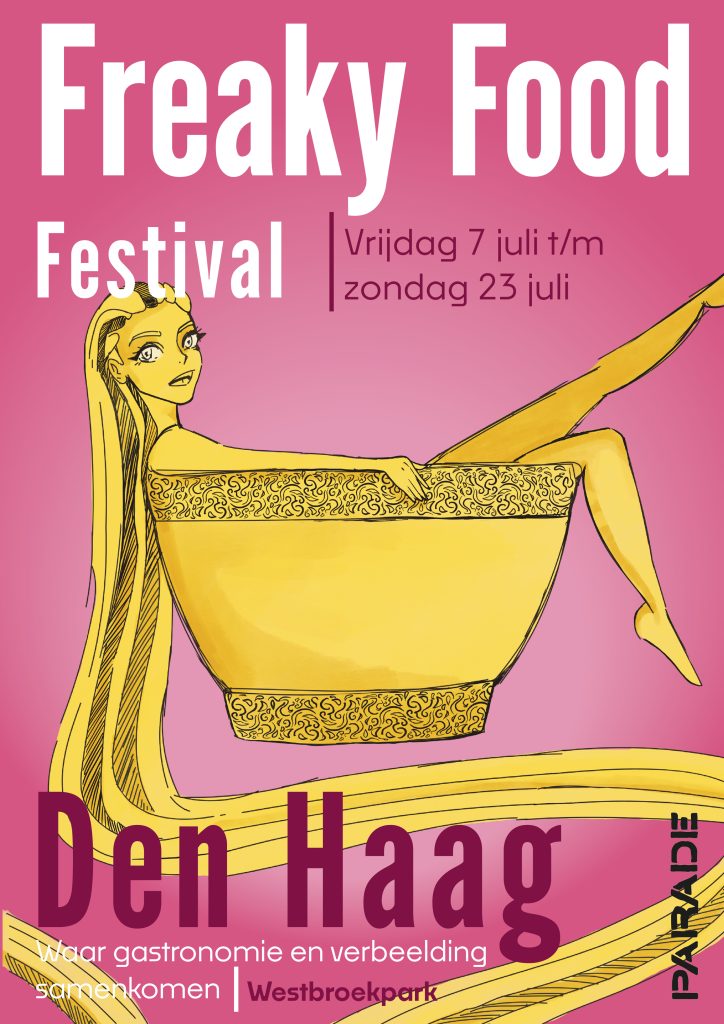
For this project, the client asked if I wanted to make a poster series of three. These posters all had to be in the same style and match each other. The subject of the poster is Freaky food festival. This is an event where they sell separate food and everything is slightly different than normal. I have reflected this as much as possible in the illustration of the posters.
Explanation of the illustrations
Because the client wanted a slightly different poster (since it’s for a “Freaky” food festival) in my first design (the pink one) I put the character in a soup bowl and gave her noodles to spread all over the poster. see into. With the second poster (the yellow one) I put another character in a cocktail glass with eyeballs and with the third (the green one) I put a girl in a coffee cup with a lid as a hat. For my interpretation this is Freaky but not too much so that it attracts enough attention but doesn’t scare people off.